Branding for a Mental Health Therapist
This mental health therapist branding project helped a therapy, coaching, and workshop practice connect more authentically with second-generation BIPOC caregivers. Through brand strategy, messaging, cultural identity design, and visual identity design, By The Water Studio created a cohesive therapy brand that balanced professionalism, warmth, Filipino heritage, and long-term business growth.

Challenges
-
The client had previously worked with a marketing agency, but the results didn’t feel authentic to who she was or what she offered.
-
The visuals lacked cohesion and did not connect with her target audience of second-generation BIPOC caregivers.
-
The messaging leaned too formal, which clashed with her approachable and human-centered style.

Opportunities
-
We saw the opportunity to root the brand strategy in the client's Filipina heritage and lived experience as a caregiver, so her brand could feel personal and grounded.
-
We could design a visual identity that balanced professionalism with warmth by weaving in Filipino tattoo and textile patterns.
-
Positioning her as both a pioneer in therapy for second-generation caregivers and a relatable “soul friend” gave her the space to lead with authenticity.
-
By building a flexible brand system, we could set her up not only for her therapy practice today but also for her future goals of writing, speaking, and facilitating workshops.

Results
-
Designed a cohesive brand strategy and visual identity that authentically communicates the brand's core.
-
Provided messaging frameworks (mission, vision, positioning) that empower the client to speak clearly about her work and values.
-
Designed a logo inspired by Filipino patterns and personal symbolism, grounding her practice in cultural authenticity.
-
Created a brand guide covering logos, typography, color palette, patterns, icons, and photography style for consistent application.
-
Established a differentiated brand that connects in a meaningful way with her audience and sets her apart from generic wellness branding.

Discovery Process
For this project, we used a series of brand workshops to create the framework for brand messaging and overall brand guide. The focus of discovery was to uncover the core identity in order to create a foundation for messaging, marketing, and business development. Each session combined education and hands-on activities, with the client actively shaping the outcomes while I guided her through the process.
The result was a comprehensive branding framework that established visual and verbal identity, and a guide for business development, writing, and future growth.

The Logomark
The logomark is inspired by a blend of Filipino textile and tattoo patterns, combined with the natural form of a sunflower (an object the client has a personal connection with). At the center, the sunflower symbolizes growth, healing, and resilience. The stem incorporates a traditional ethnic pattern representing a centipede (a motif the client carries as a tattoo on her forearm) which speaks to transformation and cultural continuity. The head of the sunflower merges both the flower itself and the ethnic depiction of the sun, grounding the mark in Filipino heritage. Designed with geometric line work rather than solid fills, the logo honors pre-colonial aesthetics while maintaining a modern, minimal feel that is versatile across applications.


The brand color palette is rooted in natural, grounded tones that reflect presence, softness, and connection. Each shade was chosen to balance warmth and professionalism, creating an atmosphere of ease while still feeling intentional. Earthy neutrals provide a steady foundation, while brighter accents suggest new beginnings and growth. Together, the palette supports the brand's essence of being human, while giving her brand the flexibility to show up consistently across both digital and print applications.
Colors

Typography
The brand typography uses Mokoko for headlines and Poppins for body copy. Mokoko was chosen because its geometric forms echo the structure of the logomark, creating a cohesive visual language. Both Mokoko and Poppins share rounded, humanistic features and a single-storey lowercase “a”, which is the way people naturally write it by hand rather than the double-storey form often seen in typesetting. This choice reinforces the brand’s accessible, human quality. As a free alternative, Zilla Slab can be substituted for Mokoko while maintaining the same geometric character.


Iconography
Designed with the same line-based approach as the logo, creating consistency and cohesion across the brand. Each icon draws inspiration from Filipino textile and tattoo motifs while remaining simple and versatile enough for modern use. This balance allows the icons to carry cultural meaning while still functioning clearly in digital and print contexts.
Patterns
The patterns used in this brand are drawn directly from traditional Filipino tattoo and textile motifs. They are cultural expressions that connect the client's personal heritage to her professional practice.
Each pattern carries symbolic meaning and reflects the Filipino tradition of embedding stories into visual design. The client herself carries some of these symbols as tattoos, making their use in the brand an extension of her lived identity.
These patterns honor pre-colonial artistry and cultural roots while providing a contemporary visual layer that can be used across backgrounds, containers, and collateral. They bring depth, heritage, and authenticity to the brand without overwhelming the clean, approachable aesthetic.
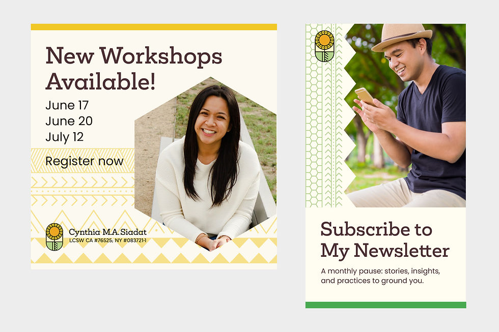
Brand Expression
The brand expression brings together all of the visual elements (logomark, colors, typography, patterns, and icons) into a cohesive system that communicates the brand's identity. Each element was designed to be strong on its own but even more powerful when used together. The logo grounds the brand in cultural symbolism, the color palette sets the tone of warmth and presence, the typography creates consistency and readability, and the icons and patterns add depth and authenticity. Together, they form a complete visual language that the client can use across digital and print touchpoints to consistently express her brand.